
You may be getting people to your contact page. They may be reading through your services, clicking around the website, and even hovering over the form. But they are not submitting it.
Or they are sending vague messages that do not give you enough information to help. Or they are choosing the wrong service, asking questions the website was supposed to answer, or disappearing after showing clear interest.
When that happens, it is easy to assume the contact form itself is the problem.
😵 Maybe it is too long.
🤔 Maybe the button is wrong.
😬 Maybe the form is broken.
😕 Maybe people are not interested enough.
Those things are all things worth checking, but sometimes the real issue happens before the visitor ever reaches the form.
They may still be trying to figure out what they need, whether you are the right fit, which service to ask about, or what will happen after they click submit.
The contact form may not be broken. It may simply be asking visitors to make too big a leap.
Your contact form may not be the real problem
A contact form is often treated like the final step. The visitor lands on the website, reads a few pages, and then fills it out.
Simple enough.
But that only works when the website has already helped them understand a few important things.
What the website should already explain
- What the business does
- Who the services are for
- Which option may fit
- What problem the business solves
- What the next step involves
- What happens after they reach out
What the visitor may still be wondering
- Which service they should choose
- How to explain the problem
- Whether they are ready
- What they are committing to
- What will happen afterward
That is a lot to ask from someone who is only a few minutes into learning about your business. Form length matters too, but the right number of fields depends on what you actually need before responding.
What a generic contact form asks visitors to do
📢
Tell me how I can help.
It may feel open, flexible, and welcoming to the business owner. To the visitor, it can feel like an assignment.
Before they can even press send, they have to decide:
- Why they are contacting you
- Which service applies
- How to describe the situation
- How much detail to provide
- What information matters
- Whether their problem is appropriate for your business
- Whether they are ready to begin
- Whether they can afford the service
- Whether reaching out will turn into a sales conversation
That is a lot of decision-making for someone who may still be thinking: “I know something is not working, but I do not know what I need yet.” A blank message field does not always remove pressure. Sometimes it creates more of it.
Signs your form may be asking for too much too soon
There are a few common signs that visitors are reaching the point of contact without enough clarity.
You may notice:
None of these automatically mean the form itself is bad.
They may mean the visitor is being asked to complete the final step before the website has helped them through the earlier ones.
Why “Contact Me” can feel like a large leap
To a business owner, contacting someone may feel like a very small action. To a visitor, it can feel much bigger.
They may be wondering:
- Is this going to turn into a sales call?
- Am I committing to something?
- Will I be pressured to book?
- What if I cannot afford the service?
- What if I choose the wrong option?
- What if I do not explain the problem correctly?
- Will I look uninformed?
- How quickly will someone respond?
- What are they going to ask me next?
Those questions can be enough to stop someone who is genuinely interested. That does not make them a bad lead. It does not necessarily mean they are not ready for help. It may simply mean the website has not created a comfortable bridge between learning and contacting.
There is a big difference between:
“I am interested.” and “I feel ready to start a direct conversation.”
Your website should help people move from one to the other.
First, make sure the form itself works
Before you redesign the whole client journey, check the practical things. Sometimes the form really is the problem.
Make sure:
- It works on desktop and mobile.
- The submit button is easy to see.
- Required fields are clearly marked.
- The form is not unnecessarily long.
- Dropdown choices make sense.
- Spam protection is not difficult to complete.
- The page loads quickly.
- The form looks trustworthy.
- The visitor receives a clear confirmation after submitting.
- The message actually reaches the right inbox.
- Replies are not landing in spam.
Test it yourself. Then ask someone who is not familiar with the website to test it too. Business owners often know exactly how a form is supposed to work. A visitor does not.
If the form is technically sound, the next question is whether the visitor has enough information to use it confidently.
What visitors need before they reach the form
A contact form should continue a conversation the website has already begun. It should not force the visitor to begin the entire conversation alone.
Before someone reaches the form, the website should help them understand:
How to make your contact form easier to use
A better contact form does not have to be complicated.
It simply needs to help the visitor understand what to do.
Use a more specific introduction
Instead of:
Contact me using the form below.
Try something more supportive:
Tell me a little about what is happening, even if you are not yet sure which service you need.
Or:
Share what you are trying to accomplish and where you feel stuck. You do not need to have the solution figured out before you reach out.
That immediately removes some of the pressure.
Ask guided questions
A blank message box places all of the responsibility on the visitor. Guided questions make it easier to begin.
You might ask:
- What are you hoping to accomplish?
- What is currently not working?
- Which service are you considering?
- What kind of support do you think you need?
- How soon are you hoping to move forward?
- Is there anything you are unsure about?
- What have you already tried?
These questions help the visitor organize their thoughts. They also give you more useful information before the conversation begins.
Which questions belong on the form depends on what you actually need to understand before you can respond well.
Let people admit uncertainty
This is one of the easiest things to add.
Include options such as:
- I am not sure which service fits.
- I know the problem but not the solution.
- I need help figuring out where to begin.
- I am still exploring my options.
That small choice can make the form feel far more approachable.
It also tells you something useful about how to respond.
Ask only what you need
Every field should have a purpose.
If you ask for a phone number, explain whether you plan to call.
If you ask for a budget, make the ranges clear.
If you ask for a website URL, make it optional unless it is genuinely required.
If you ask several detailed questions, make sure the next step feels substantial enough to justify the effort. If a question could feel personal, unexpected, or unrelated to the immediate request, briefly explain why you need it and how the answer will be used.
The goal is not to collect every possible detail.
It is to collect enough information to guide the person well.
Explain what happens next
A simple note can make a big difference.
For example:
After you submit the form, I will review your message and reply by email with the most useful next step. This may include a few follow-up questions, a recommendation, or a link to schedule a conversation.
Now the visitor knows what they are agreeing to.
They are not sending a message into the unknown.
Is a shorter contact form always better?
You will often hear that fewer fields lead to more submissions. Sometimes they do. But shorter is not automatically better.
A form with only:
- Name
- Message
may feel easy to complete.
It may also produce messages such as:
Need help. Call me.
That is technically a lead, but it may not be a useful one. A slightly longer form can work well when each question is clear and relevant. The issue is not simply the number of fields.
The real questions are:
- Does the visitor understand why you are asking?
- Can they answer without confusion?
- Does the effort make sense for the next step?
- Will the information help you respond more effectively?
A five-question form that feels guided may be easier than a three-field form that leaves someone staring at a blank message box.
Alternatives to sending everyone directly to a contact form
A contact form can remain part of the website. It simply does not have to carry the entire burden of helping every visitor decide what to do next.
Help visitors understand their options
- Service comparison
- Service Match Tool
- Personalized Recommendation Tool
Help visitors understand their situation
- Diagnostic Assessment
- Readiness Assessment
- Guided intake form
- Discovery questionnaire
Give them a lower-pressure next step
- Helpful resource or email series
- Tool Fit Session
- Brief consultation
Some of these experiences use a quiz-style question-and-answer format, but the format alone does not make the experience useful. The questions, result, and follow-up still need to support a clear visitor decision or next step.
Some visitors may benefit from:
These options do not necessarily replace the contact form. They can help visitors understand what they need before they reach it.
A guided experience can take several forms depending on what the visitor needs help understanding or deciding, including service matching, diagnosis, readiness, or a personalized recommendation.
What a better path can look like
The goal is not necessarily to eliminate the contact form. It is to make sure the visitor reaches it with enough clarity and confidence to use it.
A generic path might look like this:
Visitor browses the website
→ Clicks Contact Me
→ Sees a blank message box
→ Leaves
A more guided path might look like this:
Visitor understands the problem and available options
→ Answers a few relevant questions
→ Receives useful direction
→ Completes a more relevant inquiry
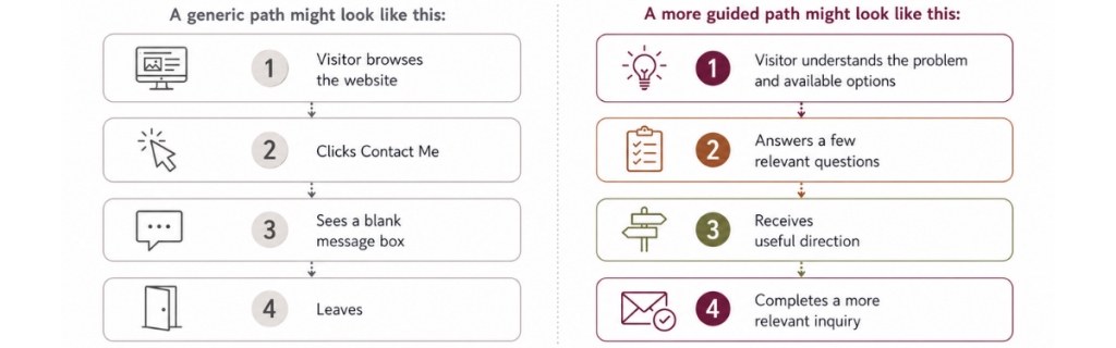
The contact form still exists. It simply becomes part of a larger path instead of being expected to do everything by itself.
When the contact form is probably not the main issue
Sometimes the form is only where a larger problem becomes visible.
The form may not be the main issue if:
- Very few relevant people are reaching the website.
- Visitors do not understand the offer.
- The wrong audience is arriving.
- Your services are difficult to distinguish.
- The website does not build enough trust.
- Pricing expectations are badly misaligned.
- The offer itself is not compelling.
- The next step is unclear across the entire site.
- Follow-up is slow or inconsistent.
- The business is relying on the form to fix unclear messaging.
When the larger website is broken, difficult to use, or unclear, the more useful first step may be improving the website and the pages around the inquiry process. If people never reach the contact page, the form is probably not where the problem begins.
When the larger website is broken, difficult to use, or unclear, the more useful first step may be improving the website and the pages around the inquiry process.
If people never reach the contact page, the problem may begin with traffic, messaging, page flow, or the path visitors are being asked to follow.
If they reach it but do not submit, the form, trust, clarity, or uncertainty may be involved.
If they submit but the inquiries are vague or poorly matched, the website may need better guidance and qualification before the form.
What to measure before changing the form
You do not need complicated analytics to begin looking for patterns. A few basic measurements can help you see where visitors are losing momentum.
Useful things to review may include:
- Visits to the contact page
- Clicks on contact buttons
- Form starts
- Form completions
- The quality and relevance of submitted inquiries
- Fields that appear to cause abandonment
- Mobile versus desktop submissions
- Which pages visitors view before reaching the form
- Completion rate
- How quickly inquiries receive a response
Numbers will not explain every hesitation, but they can help you distinguish between a form no one reaches, a form people begin but abandon, and a form that produces inquiries that are not useful.
So, what should you fix first?
Start by looking at where the path breaks down.
| What you notice | First place to look |
| People never reach the form | Page flow, messaging, and calls to action |
| People are interested but hesitant | Lower-pressure next step |
| Messages are vague | Guided questions and instructions |
| Inquiries are poorly matched | Service clarity before the form |
| People reach but do not submit | Form function, trust, length, and uncertainty |
| Visitors need help choosing | Service matcher, assessment, or recommendation |
| Relevant traffic is very low | Traffic and visibility |
If people never reach the form:
Review the page flow, service messaging, and calls to action.
If people are interested but hesitant:
Create a lower-pressure next step.
If the messages are vague:
Add guided questions and explain what information is useful.
If inquiries are poorly matched:
Help visitors understand your services before they reach the form.
If they reach the form but do not submit:
Check the form itself, then look at uncertainty, trust, length, and what the visitor is being asked to decide.
If visitors need help choosing:
A service matcher, assessment, or recommendation tool may be useful.
If the website gets very little relevant traffic:
The form may be fine. Traffic may be the real problem.
Written by Jenni Lynn, founder of Wild Root Web, where she helps service-based businesses create clearer website paths and better-qualified inquiries.
Frequently asked questions about contact forms and website leads
Help visitors know what to do before they reach out
If your contact form is asking visitors to make too many decisions on their own, the answer may not be another button or a shorter form.
They may need a clearer path.
The Find My Best-Fit Tool assessment can help you explore whether a Service Match Tool, Diagnostic Assessment, Readiness Assessment, or Personalized Recommendation Tool could help your visitors understand what they need before they contact you.
Explore which kind of interactive lead tool may fit your business.
Talk through your website, services, and visitor pathway.
Get help with the website or supporting pages that may need attention first.